I was a Design Technologist Intern at Shopify, a global commerce platform that empowers millions of merchants worldwide to sell online, offline, and everywhere in between.
I co-designed, prototyped, and launched a reimagined on-site search experience on shopify.dev, Shopify's third-party developer documentation site.
| Role | Team | Timeframe |
|---|---|---|
Product design Prototyping with code | 1 product manager 1 product designer 1 content designer | Feb-Apr 2022 (3 months) |
Context
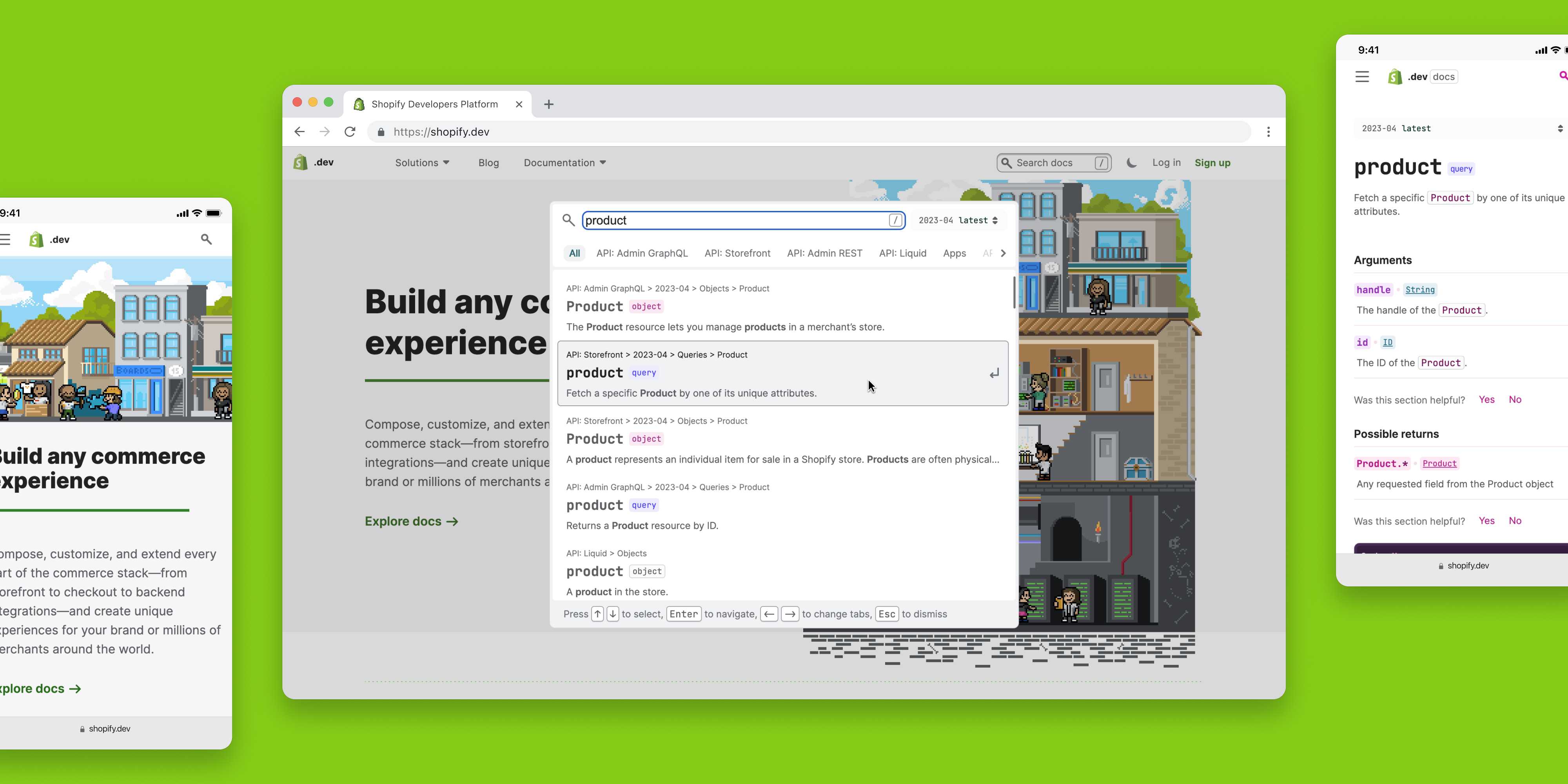
This is what the current on-site search experience looked like:
Third-party developers found the current search experience clunky and irrelevant, leading to only 0.5% of daily users using our on-site search.
"Your search functionality is awful. I use Google instead of your built-in search bar to search the docs. It needs some tender love and care."
- a third-party Shopify developer
The Challenge
With shopify.dev containing thousands of pages, the inefficiency of our on-site search resulted in third-party developers being unable to find key API resources quickly. This led to decreased Shopify app ecosystem productivity.
Understanding the Infrastructure
First, I dove deep into understanding the current technical infrastructure.
Through this, I diagnosed foundational problems with how the backend was serializing content. We were giving messy information to our search engine (ElasticSearch), and had terrible result relevancy as a result.
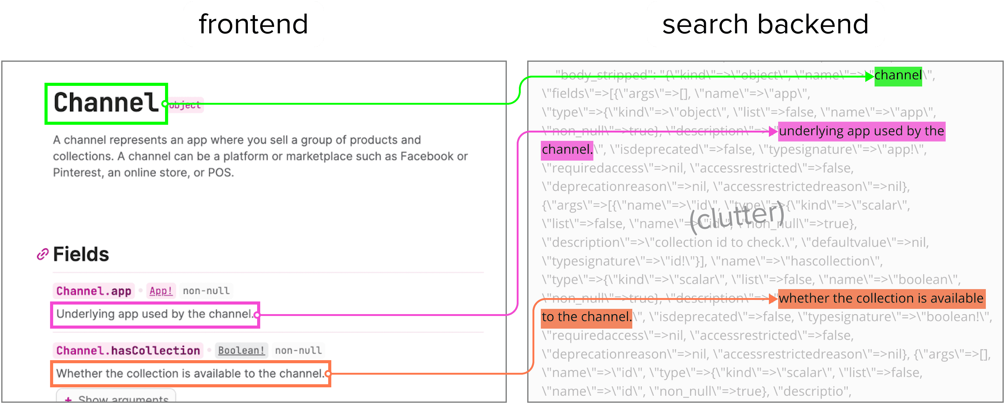
This deep-dive also helped me set a shared understanding in my team of how our search currently works.
Defining UX Principles
Our design team started defining principles and solutions based on our assumptions. But we were stopped by our product manager, who questioned what evidence these decisions were being based on.
So we took a step back, and interviewed eight third-party developers. Based on the frequency and intensity of their feedback, we defined the UX principles of our search:
Design search results for scannability
Currently, developers had to manually parse through cluttered descriptions and breadcrumbs to determine the best search result. Scannable results help developers quickly determine the best option for their use case.
Filtered search for the win
For a continuously-expanding information site like shopify.dev, providing developers the ability to narrow a large set of results down is critical.
Personalize the experience
Developers only cared about the one or two APIs used in their work. By saving their filters, our on-site search experience would be more frictionless.
Wireframing
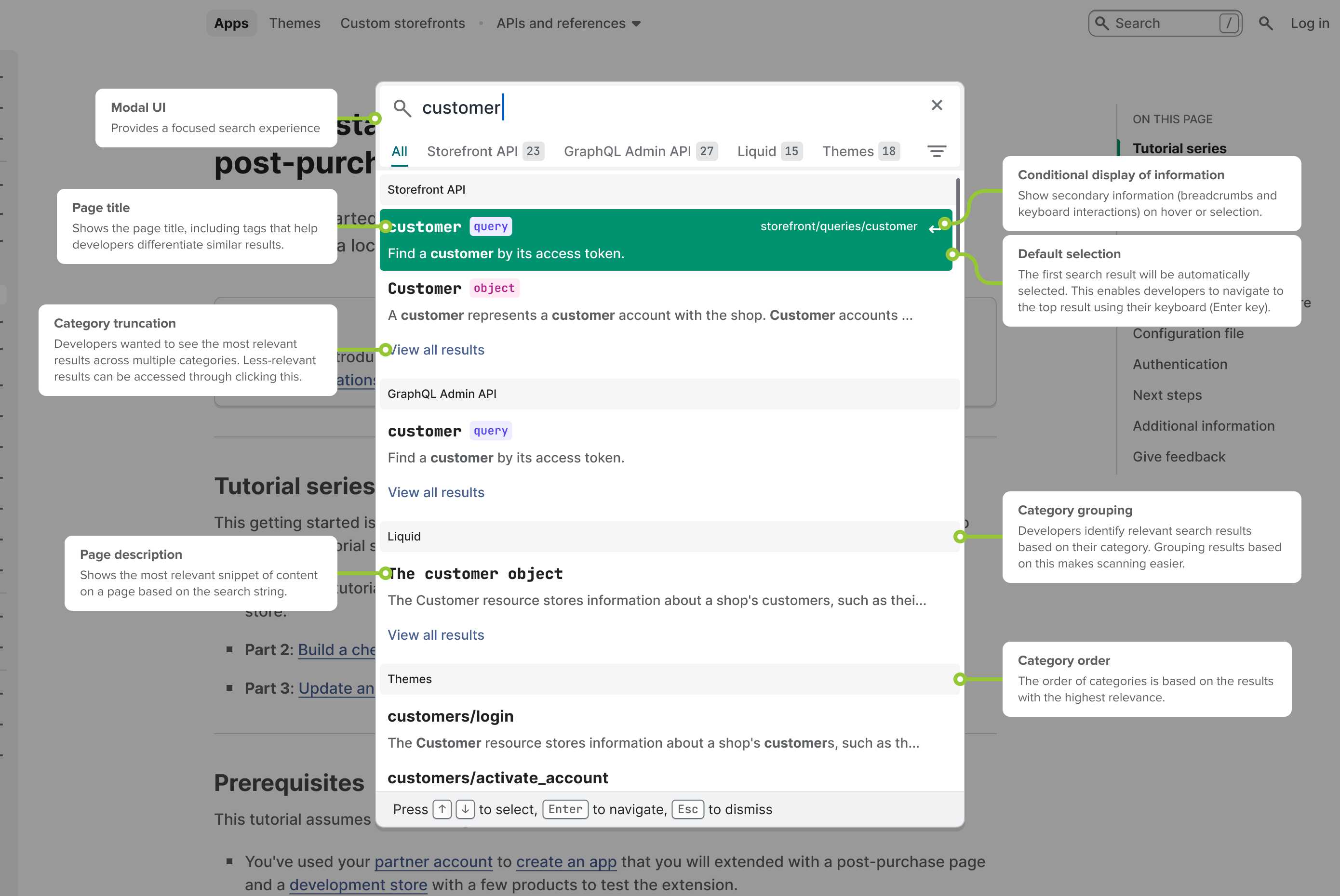
Following a competitive analysis and low-fidelity designs, I collaborated with our senior product designer and content designer to create high-fidelity Figma wireframes based on our principles:
Prototyping
I created a prototype in our production codebase with React, Ruby on Rails, and ElasticSearch.

I focused on designing the interaction-heavy filtering experiences that couldn't easily be replicated in Figma, and would benefit the most from being experimented with in a production environment.
Here's what my prototype looked like:
Filter-by-category tabs
Based on the search query, the search modal would display category-specific tabs. On click, the tabs would display results from that category. A mixture of results would be displayed by default in the 'All' tab.
Dynamic tab positioning
These tabs would be dynamically ordered from left-to-right based on the relevance of their respective categories.
Personalized filters
The search modal would also enable developers to view content only from selected categories. This helped developers focus on results for the Shopify APIs of their current project.
Saving filters
Even after navigating to away from the page, selected filters were preserved using cookies.
Clearing filters
If a developer wanted to remove their filters, they could clear them in one click.
Defining Edge Cases
My prototype also challenged our design team to solve edge cases we hadn't accounted for in our wireframes.
For example, to limit the length of the 'All (results)' tab, we truncated the search results displayed in each section. After experimenting with different algorithms, our design team chose the path that best complimented the functionality in our designs.
Implementing for the Keyboard
Another strength of coded prototypes is that it enabled our design team to design keyboard navigation, a feature required for developers.
Here's what opening, navigating, and selecting in the search modal looked like:
The Launch
Though my internship ended in April 2022, my co-designers were able to use my prototype to conduct qualitative research with users.
"We conducted some user research... and your work on prototyping the interactions was extremely helpful for validating that a modal format was the right choice and that categorization was an essential feature."
Anne Liu, design technologist
After validating our design choices, the redesigned search was developed and launched less than 4 months later in August 2022. Check it out on shopify.dev!
The search was well-received by the developer community, with the filtering and history features being especially appreciated. Quantiatively, the project was successful as well:
On-site search usage increased by 7%
Time to find correct result decreased by 22%
(actual values omitted for confidentiality reasons)
Learnings
Before this internship, my passions for product design and software engineering had always been separated. My experience as a design technologist at Shopify proved that there exists a role where these passions not only co-exist, but thrive together.
"Jayden is an awesome design collaborator, constantly sharing his work and actively requesting feedback in order to continually iterate and improve. His innate curiosity, paired with his design and development skills enable him explore UX problems from unique perspectives and arrive at novel solutions.
Jayden is a great example of the value a design technologist can bring to the product development process. I really hope we get to work together again."
Thomas Yuill, staff design technologist and mentor
Don't operate on assumptions
Our team got too excited and made the mistake of defining UX principles before research. Had we not talked to developers, we would’ve not solved their biggest pain points. If I was to do this project again, I would start with research.
Prototyping is so, so rewarding
It is incredibly empowering to prototype interaction-heavy experiences that would otherwise be impossible to create with traditional design software. The level of clarity it can bring to stakeholder conversations and user testing is unmatched.
Next project

